"An event logo is enough. We don't want to waste time on trivial things." Does this sound familiar to you? Well, congratulations then, you have found the most efficient way to ruin your event!
Why? First of all, as Patrick Newbery and Kevin Farnham note in their book Experience Design: A Framework for Integrating Brand, Experience, and Value, "We are visual animals. Sight is the predominant way that we relate to the world around us." Attendees are no exception.
For example, as the developmental molecular biologist John Medina highlights in his book Brain Rules: 12 Principles for Surviving and Thriving at Work, Home, and School, people are likely to remember only 10% of the information they hear. However, "if a relevant image is paired with that same information, people retained 65% of the information three days later."
Visual identity is mostly studied and presented as an important feature of corporation branding. According to a paper published by the Spanish researchers Rafael Bravo, José M. Pina, and Jorge Matute, "visual identity embodies any visual element that is associated with an organization." However, as Magnus Kristian Gregersen indicates in his research, visual identity is an umbrella term used interchangeably to refer to different fields of human activity.
Extended to the event industry, we are talking about the same visual elements (name, colors, logo, typography, graphic design elements, etc.) that are used everywhere else. Planning expert Julia Rutherford Silvers notes in her book Professional Event Coordination, "Identifying symbols, logos, or graphic representations associated with the event or an event organization are a form of ’branding,’ projecting an image and linking the product (the event) with an easily recognizable and consistent perception of value to the consumer."
So how can you build a powerful visual identity for your event? Here are some steps to follow:
Step #1. Decide which graphic elements and colors will define your event
As you probably know, colors can affect the way your attendees feel about your event. So be very careful with that. Align the color you choose with the philosophy and the message of your event. For example, go with purple if your event is about wellness or spirituality. Choose green if the event is focused on sustainability or the environment. And be positive about going with red for an entrepreneurship event. As for the general elements, choose a clean and easy-to-identify graphic design. You can find inspiring ideas here and here.
Step #2. Choose an adaptable graphic element and use it for different contexts
Let’s say that the central piece of your event’s visual identity is a composition of three intertwined circles. This means that the attendees will basically associate your event with this image. So you can take advantage of its adaptability (which means that you can crop it, change its colors, or alter it however you wish) and use it in different contexts, such as in collateral event materials or digital platforms.
Step #3. Use storytelling to enhance your event's visual identity
And suddenly the power went off and the attendees couldn't see anything in the room. Ha! Now you are paying attention! One of the greatest things about storytelling is that it 'distracts us from our distractions'. So don't hesitate to use this technique while working on creating your event's visual identity. For example, instead of printing a boring traditional event program, you could design it as a metro map. Or instead of a static logo slider on the venue screens, you could project a short animation that explains the origins of the logo. It will definitely intrigue your attendees.
Step #4. Respect the coherence of your event's visual identity
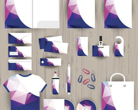
You can’t have three intertwined circles on your printed programs and four intertwined squares on the event website. If you choose a set of graphical elements, you have to stick with it for consistency purposes. Each collateral event material or digital platform should reflect a coherent visual identity, meaning you use the same graphical elements for everything. Otherwise, you’ll confuse people and they won’t be able to identify your event.
Step #5. Help the attendees identify your event's visual identity easily
From the “Save the Date” email to the last “Thank You for Attending” message, consciously display your graphic elements to help your attendees identify you. During the event, use the visual elements on badges, programs, banners, presentations, etc., which will retain your event’s image in the minds of the attendees. They probably won’t remember who the speakers were, but if you have a powerful image, they will definitely remember it.
Wrap up
The visual identity is the heartbeat of your event. Take it seriously. Educate yourself about graphic design and learn how to distinguish between good and bad visual elements. Be sure that the visual identity you create (with the help of professionals) is aligned with the philosophy of your event. And don’t forget to maintain the coherence of the graphic elements by using them correctly on collateral event materials or digital platforms.


